Improving QR Code Scannability
Tools like Hovercode allow you to easily create QR codes that incorporate your logo, brand colours, and other customizations in just a few clicks, but none of that matters if your QR codes are hard to scan.
There's nothing more frustrating that pulling your phone out to scan a QR code because something piqued your interest, then frantically tapping at your screen because the code won't scan.
How do you avoid putting people in that situation with your QR codes? Follow these tips on the best QR code practices for scannability (that might not be a real word, but you know what we mean!)
Size matters
When it comes to QR codes, size is a crucial factor that can make or break your code’s functionality. Too small and your QR code will be unscannable.
What is the right size? Well, this depends on your use case.
The recommended QR code minimum size is: 2cm by 2cm, but it's better to be safe and go with 4cm+, especially if your QR code includes a frame and an embedded logo.
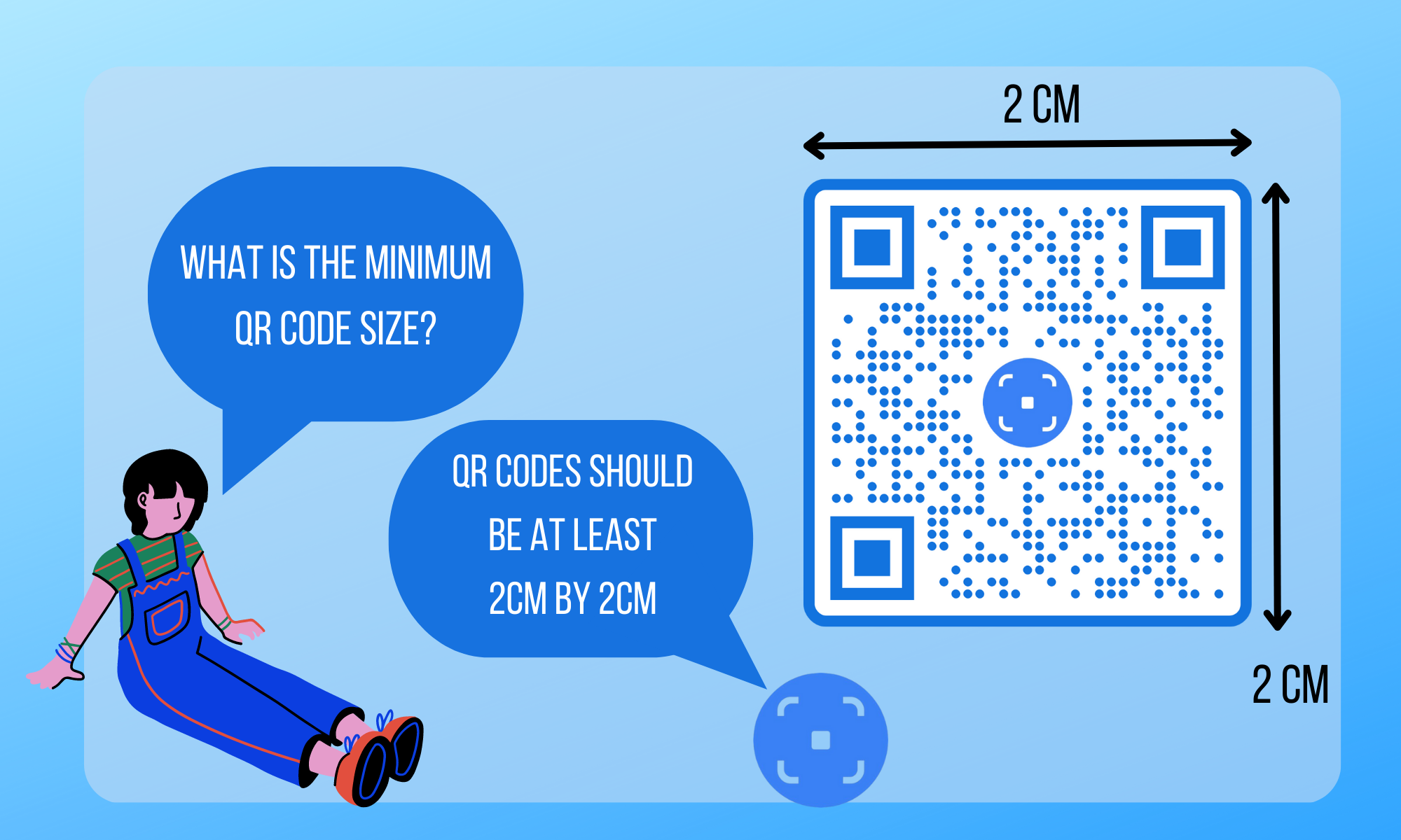
If you are planning on putting your QR code on a billboard or a poster that is going to be viewed from a distance, a good rule of thumb is a ratio of scanning distance to QR code size of 10:1. For example, if the person scanning the QR code will be 10m away, the QR code should be at least 1m by 1m.
While technically you can’t make a QR code too big, simply enlarging the code does not mean it will remain scannable. You still need to follow the best practices laid out in this article.
Check the contrast
Here we have two QR codes, one is easily scannable and the other is not. The most scannable is the one with high contrast, i.e the one on the left. If your QR code is low contrast phones struggle to scan it. If people can’t point their phone and scan your QR code quickly, they won’t bother doing it and you lose traffic.

Although it's the safest bet, your QR code doesn’t have to be black and white to create enough contrast. You can absolutely play around with colours to make your QR code brand specific. However, it does need to have sufficient contrast between the background and foreground. Make sure the foreground is significantly darker than the background colours (or the reverse).
Minimise reflective surfaces
I was recently at a conference which used QR codes to the lanyards that were handed out to every attendee. The QR code scanned to the conference program, which was super helpful. It's a great idea in theory and one any event planner should consider.
The problem in this case was that the lanyard was glossy & reflective, which made it difficult to scan the QR code, especially while outdoors in the sun.
The issue of the reflective surface was even more problematic in this case because the QR code has a yellow pattern on a white background. There wasn't enough contrast between the yellow and the white.
If you're going to be printing your QR codes on reflective surfaces like lanyards, plastic bottles etc, consider alternative approaches (e.g. stickers). If they really need to be printed onto the reflective surfaces, be really careful with the colors your pick and consider going with the tried and tested black & white QR code colors.
Include a quiet zone
The "quiet zone" is the area surrounding your QR code. Ensure that there is sufficient "white space" surrounding your QR code wherever it is displayed. It doesn't actually have to be white, but it should match the background color of your QR code.
The best practice is for the quiet zone to be no smaller than the width of 4 "modules" of your QR code pattern (the dot pattern if your QR code). Most QR code generators, including Hovercode, ensure that their generators have a large enough quiet zone.
Don't use a huge logo
Some QR code generators (including us) let you add logos to your QR code. These logos should remain fairly small as if they're too big they cover up too much of the scannable part of the QR code.
Hovercode makes sure your logo isn't too large without you having to do any additional work, but if you're adding a logo using a different method, make sure you test to check if it's not causing your QR code to be harder to scan.
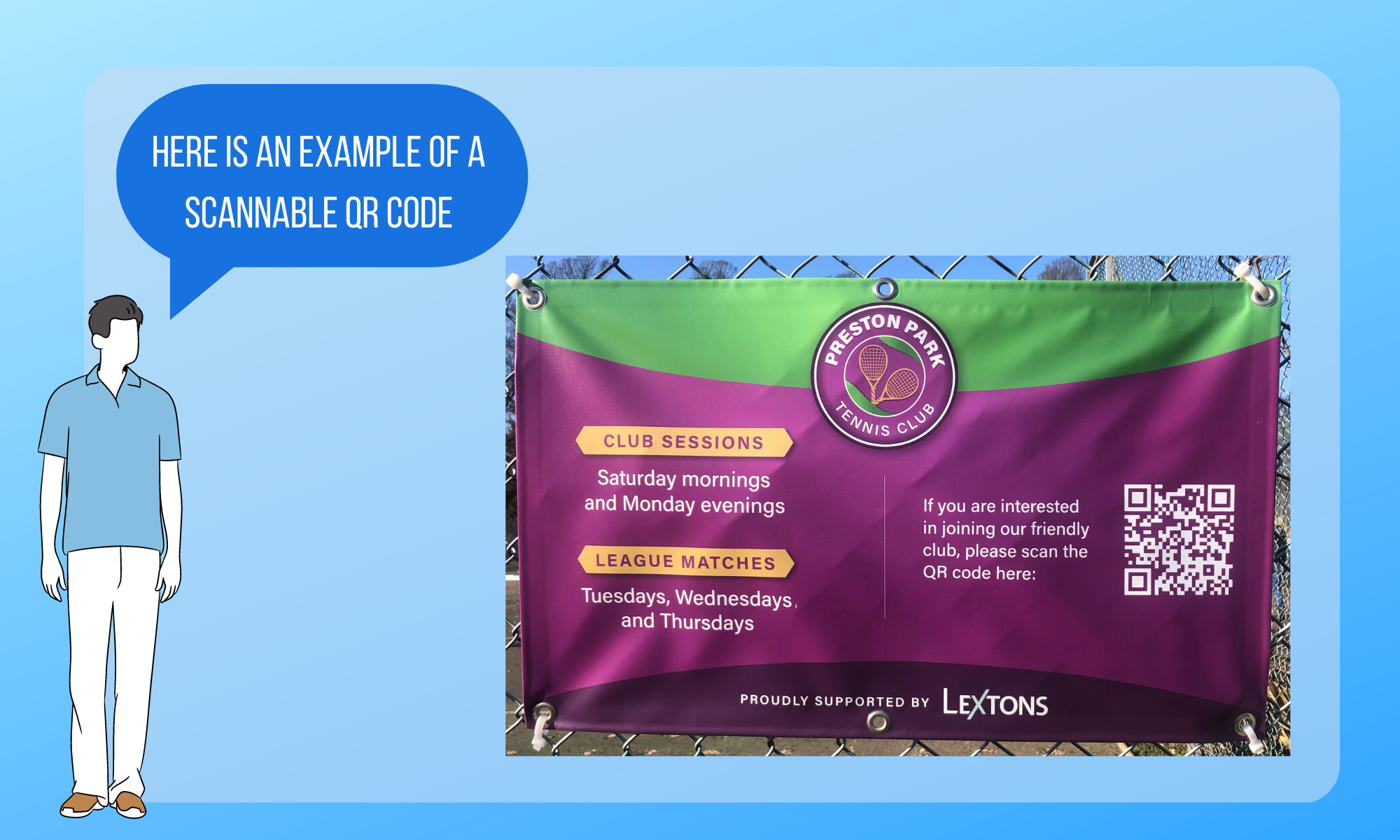
QR code placement
Your QR code might be the right size and on the perfect background, but if you put your QR code near the ground, on an uneven surface, or in a hard-to-scan place, people will struggle to scan it. Make sure your QR code is at eye level where someone can easily spot it and scan it without having to hold their phones at weird angles.
I recently spotted a tiny QR code on a chocolate wrapper that I couldn't scan without unfurling a fold. Avoid this type of QR code placement!
Finally, test the QR code before you launch it
Whether you are printing your QR code or adding it to a website, check it works before you send it out into the world. You may have put it on the perfect paper, made it the right size, and done everything else perfectly but sometimes things go wrong. Test it out with your phone to make sure it is scannable and readable.
QR codes are a powerful tool for promoting your business and connecting with customers. If your QR codes are not easily scannable, they will be of little use to you. By taking these steps you can make the most of your QR codes.